📘 NCERT Exercise 12.1 – Class 9 Maths Solutions by Mathify.in
Mathify.in provides comprehensive and easy-to-understand solutions for Class 9 Chapter 12 – Statistics, tailored to help students master all the essential concepts, formulas, and calculations before their exams. Crafted by subject matter experts, these solutions are designed to ensure clarity, accuracy, and alignment with the CBSE syllabus.
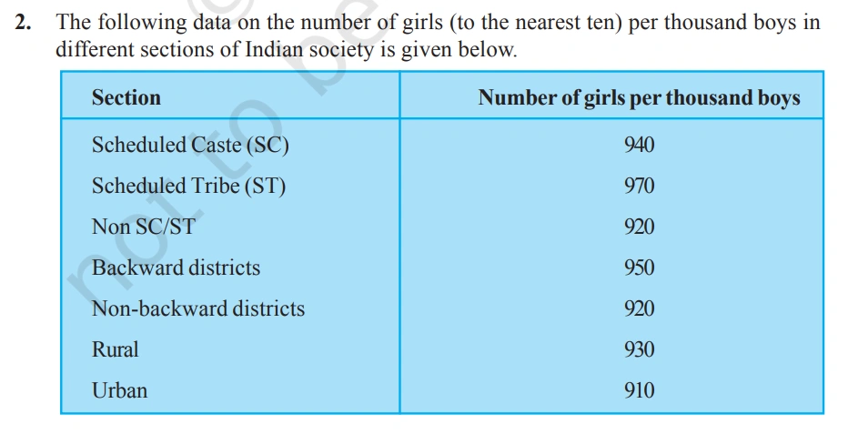
🔢 What Exercise 12.1 Covers:
- Focuses on measures of central tendency – including mean, median, and mode
- Helps students learn to compute these values for various data sets
- Emphasizes interpretation and real-world application of results
Important Links:-
📊 Why It Matters: By working through the problems, students gain:
- Skills to effectively summarize and analyze data
- A foundational understanding for future studies in statistics, economics, and science
- Access to solved examples and previous years’ question papers for thorough exam preparation
With Mathify.in, statistics becomes more than just numbers—it becomes a tool for understanding trends and making informed decisions.

Solution:-
(i) A suitable scale is selected along the x-axis to represent different causes. Each bar is drawn with equal width, and the spacing between adjacent bars remains uniform. The female fatality rate is plotted on the y-axis, where the highest value—31.8—is represented. To accommodate this, the scale chosen for the y-axis is 1 unit = 4%.
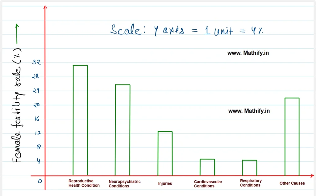
(ii) Reproductive health conditions represent the leading cause of illness and mortality among women globally, accounting for the highest female fatality rate of 31.8%.
(iii) The primary reason for high female fatality rates is the inadequate access to medical facilities and limited awareness about diseases affecting women.
Solution:-
(i) A suitable scale is selected along the X-axis to represent different causes, ensuring equal bar widths and uniform spacing between each bar. The Y-axis is labeled as ‘Number of girls per 1,000,’ with an appropriate scale chosen to represent the data range of 910 to 970. Hence, the scale used on the Y-axis is** 1 unit = 10 girls, **allowing the bar graph to be plotted accurately and proportionately.
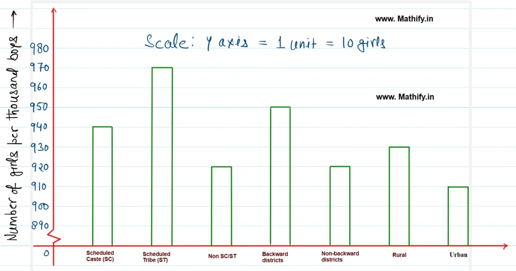
(ii) As per conclusion of the graph, the Number of girls are higher in ST. Number of girls are same in SC/ST and Non-Backward districts. the number of girls per 1000 boys is maximum (970) is scheduled Tribe and minimum (910) in urban areas.
Solution:-
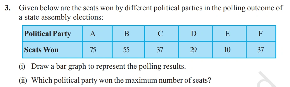
(i) A suitable scale is selected along the X-axis to represent various causes, with equal width for each bar and uniform spacing between them. The Y-axis is labeled ‘Number of seats won,’ and to accommodate the highest value of 75, a scale of 1 unit = 10 seats is used. Based on this, the bar graph is drawn accurately to reflect the data.
(ii) Political party A won the maximum (75) number of seats.
Solution:-
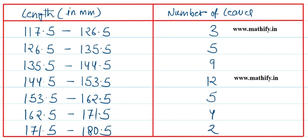
(i) Adjusting to Continuous Class Intervals:
The given class intervals are not continuous, meaning there are gaps between the upper limit of one class and the lower limit of the next.
To make them continuous, we apply the following method:
- Subtract 0.5 from each lower limit
- Add 0.5 to each upper limit
After adjustment, the revised continuous class intervals become:
117.5 – 126.5, 126.5 – 135.5, 135.5 – 144.5, and so on.
The histogram for the data is given below:
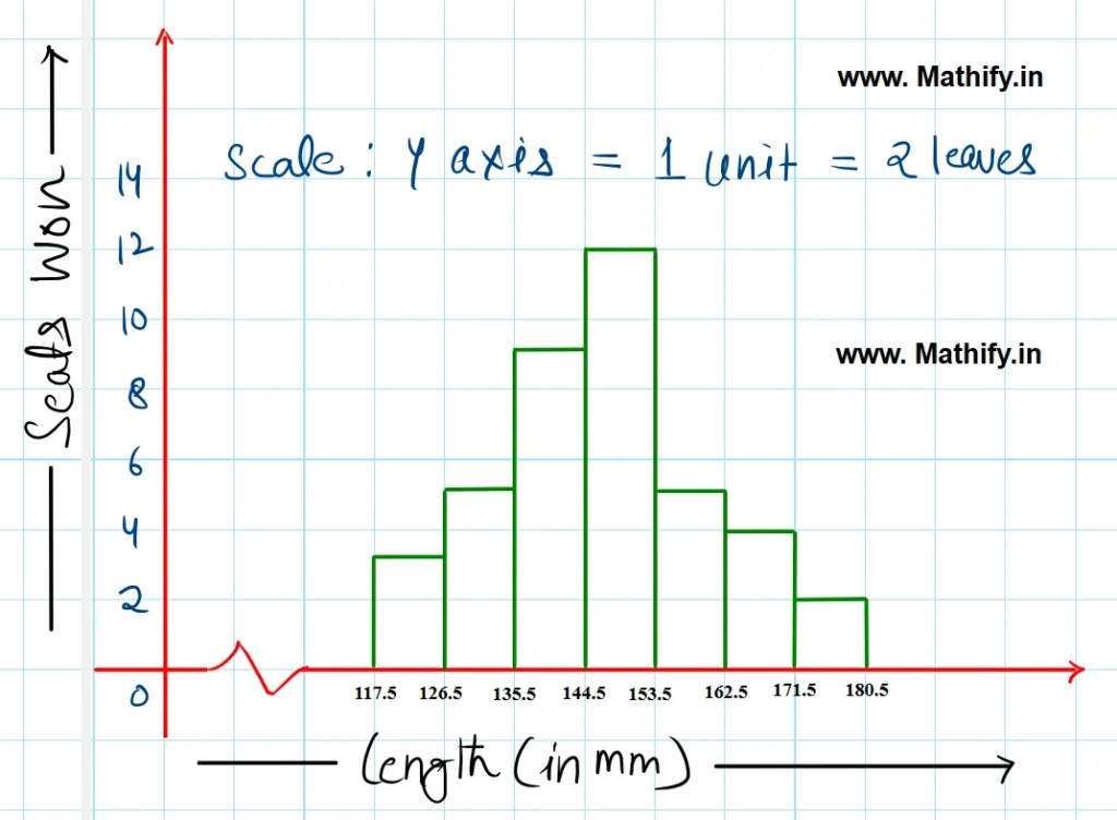
(ii) The other suitable graphical representation for the same data is frequency polygon.
(iii) No, although the number of leaves is highest (12) in the 133.5 to 153.5 range, this does not imply that each leaf measures exactly 15.3 cm in length. The frequency only shows how many leaves fall within that interval — not the precise length of each one.
Solution:-
The histogram represnting the above data is given below.
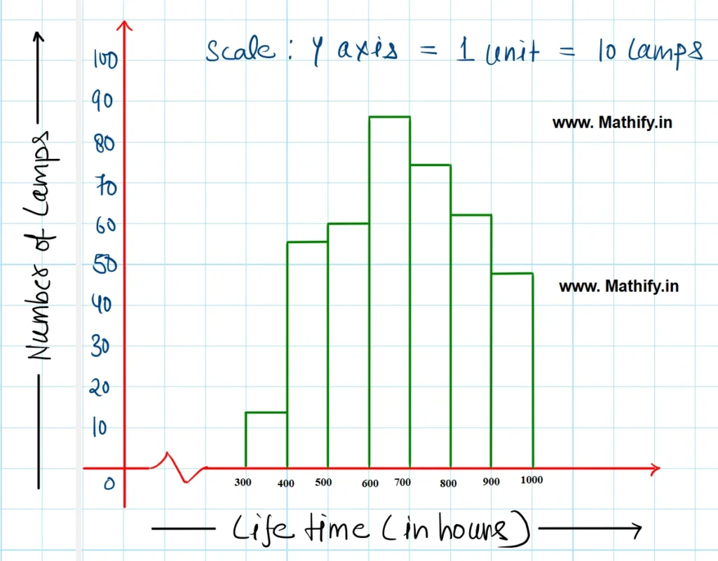
(ii) 184 (74 + 62 + 48 = 184 ) lamps have a life time of more than 700 hours.
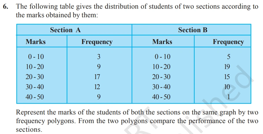
Solution:-
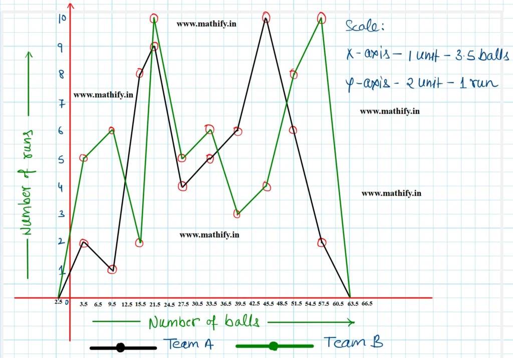
The frequency polygon of the above data is given below:
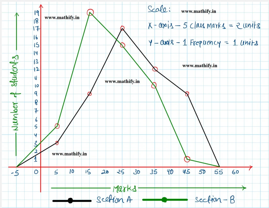
The comparison of two polygons states that the performance of students of section A is better than section B.
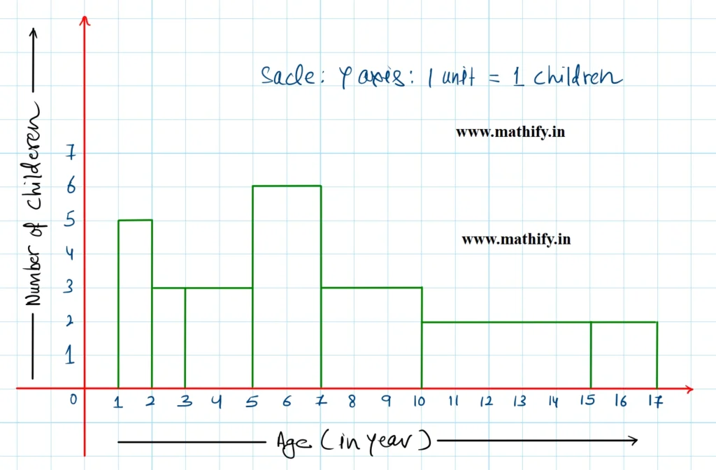
Solution:-
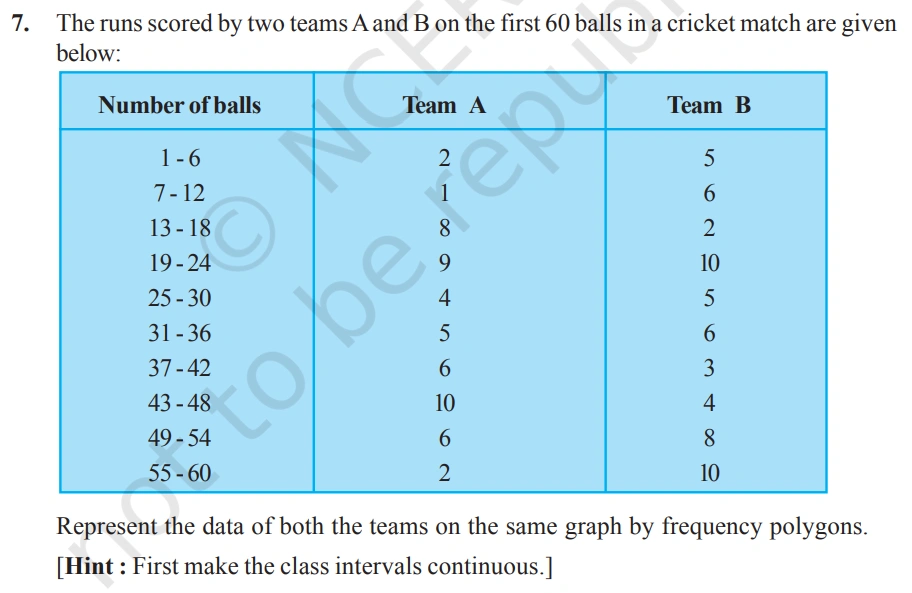
Here, the class intervals are not continous. So, to make it continous, add 0.5 to upper limit and subtract 0.5 from the lower limit. The new class intervals are 0.5 – 6.5, 6.5 – 12.5, 12.5 – 18.5, etc.
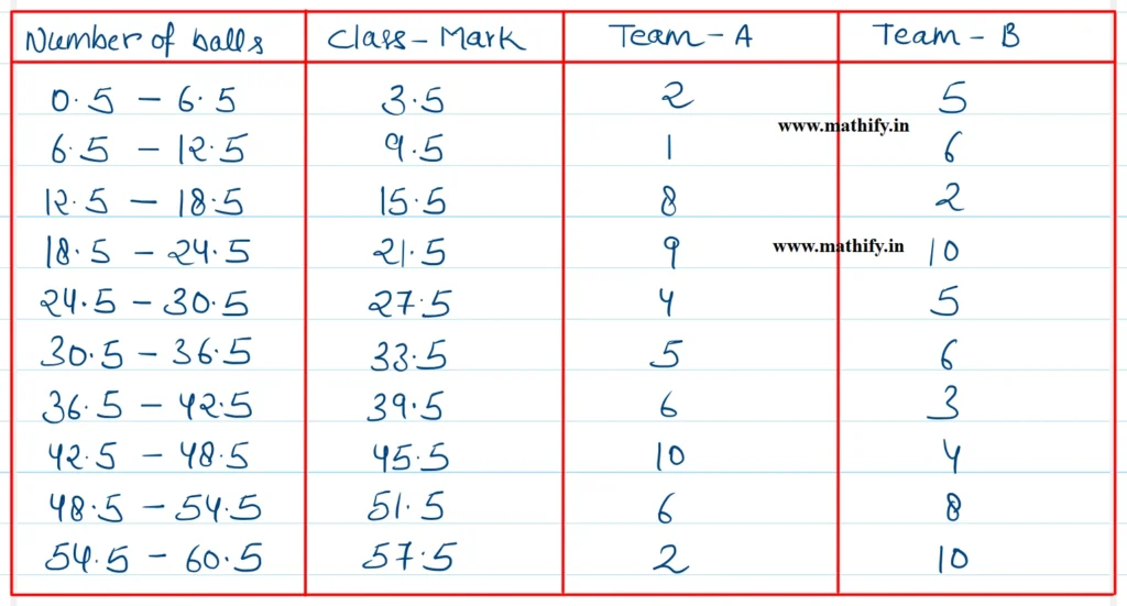
The frequency polygon representing the above data is given below:
In a histogram, the area of each rectangle is directly proportional to the frequency it represents. When the widths of rectangles vary, simply using height (or length) as frequency can lead to inaccurate interpretation. Therefore, to maintain proportionality, the height of each rectangle must be adjusted so that the area — calculated as width × height — accurately reflects the corresponding frequency.
Solution:-
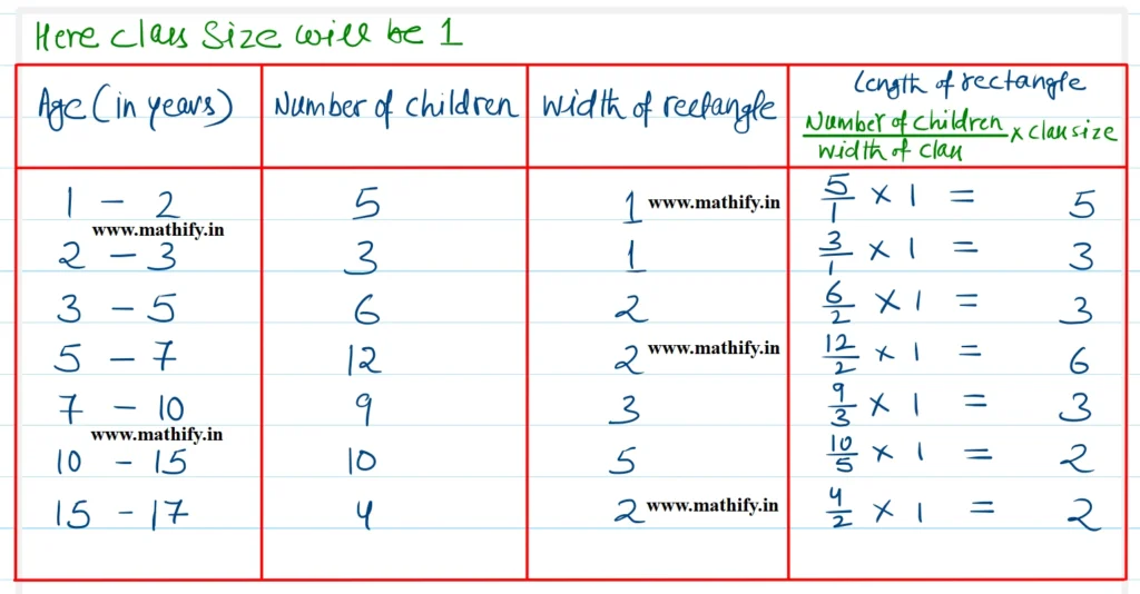
Following is the histogram
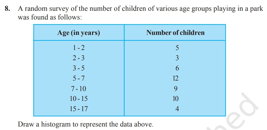
Solution:-
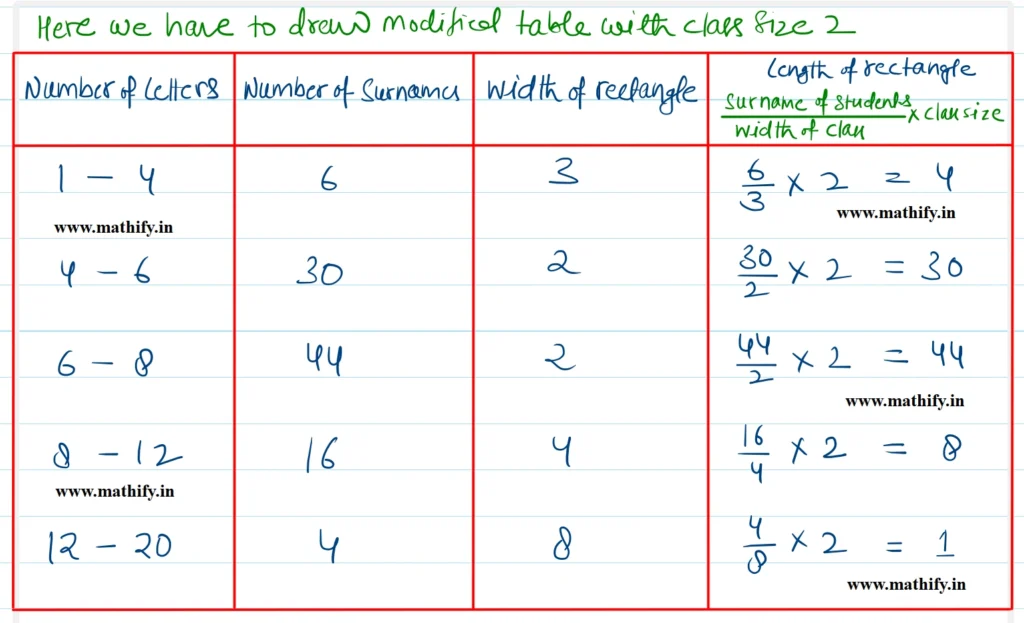
In a histogram, the area of each rectangle visually represents the frequency of the corresponding class interval. When the widths of the rectangles are unequal, using only the height (or length) to depict frequency can be misleading. To ensure that the area remains proportional to frequency, the height of each rectangle must be adjusted accordingly so that the product of width and height accurately reflects the frequency.
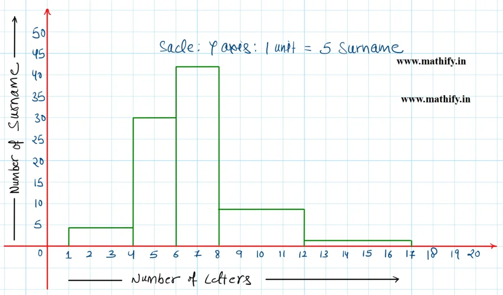
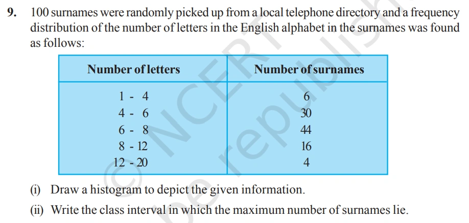
(ii) In the Class interval 6 – 8, the maximum (44) surnames lie.
Important Links:-